
You have the photos. You have the wall space. But somehow the room still doesn't look like those Pinterest boards you've saved.
The difference between a wall that looks curated and one that looks random isn't the number of photos - it's whether your photos, formats, and arrangement all speak the same visual language. That's what aesthetic means in practice: a consistent style where every element reinforces every other element.
This guide breaks down the five dominant photo decor aesthetics, exactly which print formats work for each, and how to execute them without it looking like a college dorm project. If you want the broader framework for planning any photo display, start with photo room decor ideas India - this post goes deep on one specific dimension: aesthetic matching.
Why Aesthetic Consistency Matters More Than Print Count
Interior designers talk about "visual noise" - the feeling of too much competing for attention. A wall with 20 photos in clashing styles creates more noise than a single large print, while a wall with 20 photos in a coherent aesthetic can feel serene and intentional.
The variables that determine aesthetic consistency:
- Colour temperature - warm (golden, amber), cool (blue, grey), or neutral tones across all prints
- Print format - polaroid, square, strip, A4, landscape - mixing random formats looks chaotic
- Frame style - wood, black metal, white, no frames - mixing frame types undermines cohesion
- Spacing rhythm - tight cluster vs airy grid vs layered overlap - pick one and commit
- Content theme - people, places, nature, abstract - having a mix isn't the problem; the visual tone is
Think of it like a film with a consistent colour grade. Each frame might show something different, but they all feel like the same world.
The Five Aesthetics — And How to Execute Each
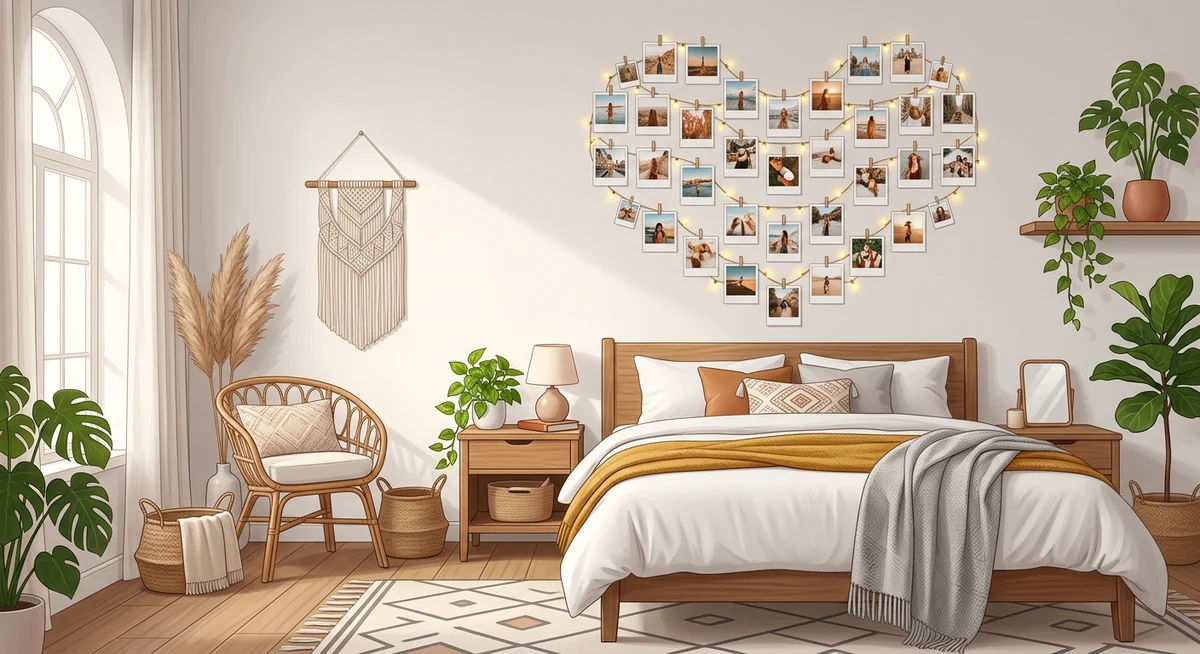
1. VSCO Aesthetic
Mood: Warm, nostalgic, effortless. Golden hour colours, candid moments, lived-in feeling.
Colour palette: Amber, warm white, terracotta, sage green, dusty rose.
Best print formats: Polaroids (the format was made for this aesthetic), 4x4 square prints, photo strips for variety.
Arrangement style: Loose scatter or string light display. Avoid grids - VSCO lives and dies by intentional imperfection.
What to add around the prints: Fairy lights threaded through, dried pampas grass, small Polaroid frames, a corkboard with a mix of prints and other ephemera.
What ruins it: Glossy prints (matte only), bright white backgrounds, symmetric grid layouts.
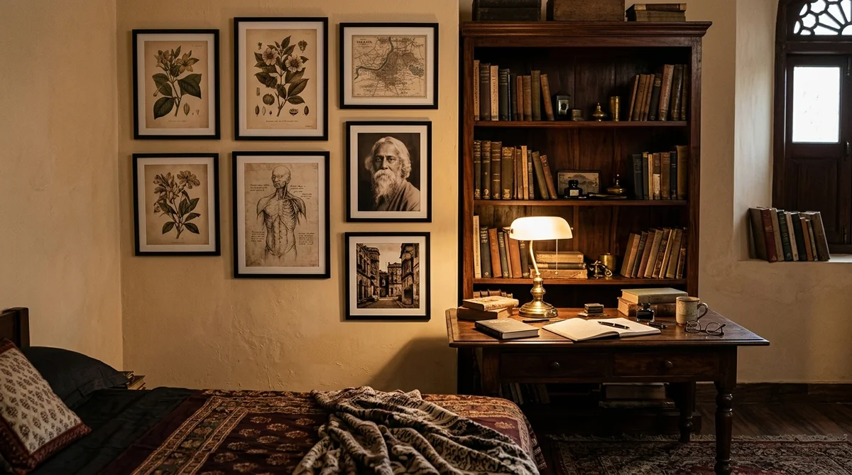
2. Dark Academia
Mood: Literary, moody, intellectual. Old libraries, autumn leaves, coffee and candlelight.
Colour palette: Brown, sepia, forest green, burgundy, cream, charcoal.
Best print formats: A4/A5 prints in dark wooden or antique-style frames. Black and white conversions work well. Avoid polaroids - too casual.
Arrangement style: Layered gallery wall with varied frame sizes. Asymmetric, like an old Victorian study. Mix photos with botanical prints or vintage maps if you have them.
What to add around the prints: Dark wood shelves, stacked books, a desk lamp, dried flowers in dark vases.
What ruins it: Bright colours, white frames, modern minimalist furniture underneath a dark academia wall.
3. Pastel Aesthetic
Mood: Soft, dreamy, feminine. Think candy colours, clouds, ice cream, first light of morning.
Colour palette: Lavender, mint, baby pink, peach, soft yellow, sky blue.
Best print formats: Square prints in matching pastel frames, or frameless polaroids with a clean grid. The symmetry of a grid works perfectly with this aesthetic - it matches the orderly, pretty nature of pastel.
Arrangement style: Even grid (3x3, 4x4) or horizontal row. Spacing should be consistent - 2-3cm gaps throughout.
What to add around the prints: Pastel string lights (not warm white - get pink or purple), matching accent pieces in the same palette, pink or white curtains.
What ruins it: Warm-toned photos mixed in, inconsistent frame colours, dark furniture dominating the wall.
4. Minimalist Aesthetic
Mood: Clean, calm, intentional. Every element earns its place. Less is genuinely more.
Colour palette: White, off-white, light grey, black. Occasional muted earth tone as an accent.
Best print formats: 1-3 large prints (A4 or bigger) in thin black or white frames. Or a single oversized photo as a statement piece. Avoid polaroids and photo strips - too decorative for this aesthetic.
Arrangement style: Single centred print, or a carefully spaced horizontal triptych. Leave significant white space. The wall itself is part of the composition.
What to add around the prints: As little as possible. A single plant, a clean shelf, nothing on the wall competing with the photo.
What ruins it: Cluster arrangements, mixed frame sizes, colourful photos with busy backgrounds.
5. Cottagecore Aesthetic
Mood: Rural, warm, handmade. Wildflowers, golden fields, simple pleasures, countryside kitchens.
Colour palette: Warm beige, honey, terracotta, dusty sage, cream, rust.
Best print formats: Polaroids or 4x4 squares. Printed on matte paper. Mix in botanical/nature photos alongside people photos.
Arrangement style: String light display or corkboard. Use washi tape or twine for mounting - it adds texture. A "mood board" style arrangement with some overlap works well.
What to add around the prints: Dried flowers pinned directly around the prints, small handwritten notes, pressed leaves, woven baskets on nearby shelves.
What ruins it: Digital-looking edits, cool blue tones, ultra-modern furniture.
Choosing Photos That Match Your Aesthetic
Your photo selection matters as much as your arrangement. A VSCO wall with one cold-toned Instagram photo breaks the spell. Here's how to filter your camera roll by aesthetic:
For VSCO: Look for photos taken in warm light (golden hour, sunset, warm indoor light). Candid moments, natural settings. Edit toward warm tones before printing.
For dark academia: Photos taken in shade or overcast light work best. Architecture, books, foggy landscapes. Convert some to black and white or sepia for cohesion.
For pastel: Photos with soft backgrounds, light and airy compositions. Overcast or diffused light. Avoid photos with deep shadows or strong contrast.
For minimalist: Select photos that stand on their own - a striking portrait, a landscape with strong composition, an abstract detail. Every photo needs to justify its presence independently.
For cottagecore: Nature photos, outdoor picnics, garden moments, pets in fields. Food photos (simple, rustic-looking). Anything that looks like it could have happened before screens existed.
Memoriffy's waterproof, matte-finish prints are designed for wall display - no fading, no warping, no glare. Every format from polaroid to A4.
Order Aesthetic Photo PrintsRoom-by-Room Aesthetic Execution
Bedroom
The bedroom is the easiest room to commit to one aesthetic because it's personal space - only you need to live with it. The headboard wall is prime territory. For VSCO or cottagecore, a string light display with polaroids above the headboard creates a warm, bedroom-specific look. For dark academia, a vertical gallery of 3-5 framed A4 prints on one side of the bed works better than above the headboard (reduces glare when the lights are on).
The mistake most people make in bedrooms: spreading photos across multiple walls. Pick one feature wall and commit. One well-done wall looks intentional; photos on three walls looks like you ran out of space elsewhere.
Study or Desk Area
The wall facing your desk is where you'll spend hours looking. Make it work for you. Dark academia is the natural choice for a study - the literary, thoughtful aesthetic matches the purpose of the space. A curated gallery of 4-6 framed prints, interspersed with a small corkboard for current notes and a shelf for books, creates a space that actually feels like it belongs to someone serious about their work.
For a lighter study aesthetic, minimalist works well - a single large print of a landscape or a meaningful portrait keeps the wall interesting without becoming a distraction.
Hostel Room or PG
Constraints: white walls, shared space, no permanent holes. This is where the damage-free mounting methods (Command strips, washi tape, magnetic strips) that we covered in the room decoration guide become essential.
Pastel and VSCO aesthetics work best in white-walled PG rooms because they were built for bright white backgrounds. A grid of square prints in matching pastel frames, mounted with Command strips, transforms a generic white wall in under an hour and comes down cleanly when you leave.
Living Room (Shared Spaces)
Shared spaces require more neutral aesthetics. Minimalist and a restrained version of VSCO (warm tones, curated selection) work better than dark academia or heavy cottagecore, which feel too personal for shared viewing. In a living room, 3-5 large prints in a considered arrangement make a stronger statement than a densely packed collage.

Aesthetic Photo Printing: Format Reference
Here's a quick reference for which formats suit which aesthetics:
| Aesthetic | Best Formats | Finish | Avoid |
|---|---|---|---|
| VSCO | Polaroid, 4x4 square, photo strip | Matte | Glossy, large A4 frames |
| Dark Academia | A4, A5 in dark frames | Matte or satin | Polaroids, colourful frames |
| Pastel | 4x4 square grid, polaroid grid | Matte | Mixed frame colours, irregular spacing |
| Minimalist | A4/A3 single prints, triptych | Matte | Cluster arrangements, mixed formats |
| Cottagecore | Polaroid, 4x4 square, corkboard mix | Matte | Glossy, digital-looking edits |
One note on finish: matte works for every aesthetic. Glossy is specific - it suits vibrant, high-contrast photos in modern settings but clashes with the organic, textured feeling that most of these aesthetics aim for. If you're unsure, print matte. More on this in the matte vs glossy comparison.
The Biggest Mistake: Aesthetic Mixing
The single most common reason photo walls look cluttered instead of curated: mixing aesthetics without knowing it. VSCO warm-toned polaroids next to a dark academic framed print next to a glossy holiday photo. Each individually decent, together incoherent.
This doesn't mean every photo needs to be identical. Within an aesthetic there's range. A VSCO wall can have 20 different moments - as long as the colour temperature, format, and arrangement all stay consistent.
Before ordering prints for a wall, do this exercise: open Pinterest, search "[your aesthetic] room India", and look at 10 reference photos. What print format appears most? What finish? What frame style? What's the spacing? Let those answers guide your order rather than going by instinct.
Frequently Asked Questions
What is the most popular aesthetic for room decor with photos in India?
VSCO aesthetic is currently the most popular in India, particularly among college students and young professionals. It works well with warm Indian lighting and the casual, candid photo culture (phone cameras, group outings, travel moments) that most people's camera rolls already reflect. Cottagecore is growing quickly as a second preference.
Can I mix two aesthetics in the same room?
Yes, but only if they're on different walls or in different zones. A dark academia study corner and a VSCO bedroom wall in the same room can coexist if they're separated by furniture. What doesn't work is mixing aesthetics on the same wall - that creates visual noise rather than variety.
Do I need to edit my photos before printing for an aesthetic room?
Not necessarily, but it helps. For VSCO, applying a warm filter (slightly increased exposure, warm highlights) before printing improves cohesion. For dark academia, converting some photos to black and white or sepia unifies the palette. For pastel and minimalist, selecting photos with the right tones at the shooting stage is more important than heavy editing.
What print size is best for an aesthetic bedroom wall?
For VSCO and cottagecore: polaroid (2.5x3.5 inches) and 4x4 square prints work best. For dark academia: A5 (5.8x8.3 inches) and A4 (8.3x11.7 inches) in frames. For minimalist: one or two A4 or A3 prints as a statement. For pastel: 4x4 square prints in a grid. See the photo print sizes guide for complete dimension reference.
How many photos should I print for an aesthetic wall?
It depends on aesthetic and wall size: VSCO string displays look best with 15-25 polaroids on a standard bedroom wall. Pastel grids typically use 9-16 square prints. Dark academia gallery walls work with 4-8 framed prints. Minimalist walls use 1-3 prints maximum. The key rule: decide the number before you order, not after - printing too many and cramming them in ruins the intentional look.
Where can I order aesthetic photo prints in India?
Memoriffy prints polaroids, square prints, photo strips, and larger formats on waterproof, matte-finish paper that holds colour accurately for aesthetic displays. All prints ship across India. Order at memoriffy.com.