
Two photo books. Same photos. One looks like a proper keepsake - the other looks like a school project.
The difference is almost never the photos. It's the design decisions made before ordering: which layout, which cover, how many images per page, whether to add text. Get those right and even ordinary photos produce a book worth keeping. Get them wrong and even exceptional photos produce something forgettable.
The direct answer: Good photo book design comes down to four decisions - cover choice, layout style, theme consistency, and photo editing before upload. This guide covers each one with specific ideas for Indian occasions and printing context.
Voice search answer: The best photo book designs start with a strong cover image, consistent layout throughout, and no more than 6-8 photos per page. Less is more.
Key Takeaways
- Cover image choice is the single highest-impact design decision - it sets the tone for everything inside.
- Three layout types cover most use cases: grid (multiple images per page), full-bleed (one image fills the page), and text + photo (image with caption or title).
- Occasion themes - wedding, travel, family, Indian festivals - work best when the design language matches the mood of the content.
- Most photo books are improved by using fewer photos, not more. 60-80 images across 20-30 pages is a better experience than 200 images crammed in.
- Paper finish affects readability: glossy for vivid colour photos, matte or lustre for portraits and text-heavy pages.
Table of Contents
- Start With the Cover
- Layout Ideas That Work
- Theme Ideas by Occasion
- Design Tips That Separate Good Books from Forgettable Ones
- What to Avoid
- FAQ
Start With the Cover
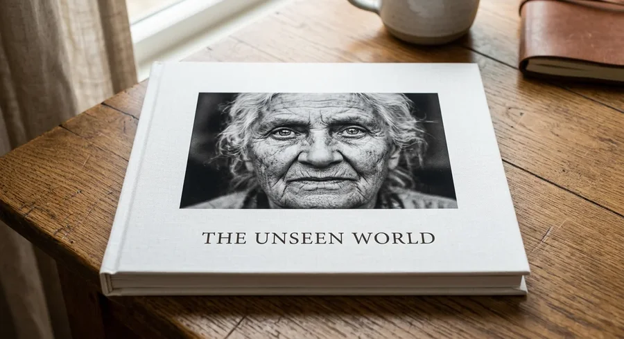
The cover is the only page every person who picks up the book will see. Most people design it last. That's backwards.
Start with the cover image. It should be your single strongest photo - not your favourite memory, but your visually strongest image. High resolution, clean background, subject well-lit. A blurry or cluttered cover signals a poorly designed book before anyone opens it.
For the cover design itself, three approaches work consistently well:
Full-image cover - the photo fills the entire cover with the title in a clean font over a dark or light area of the image. Works best when the cover photo has clear negative space for text placement.
White border cover - the photo sits centred on a white or cream background with the title below. Looks more formal and book-like. Good for wedding albums and family keepsakes.
Title-first cover - a strong title or name takes prominence, with a smaller photo below or beside it. Works well for themed travel books or memorial albums where the concept matters as much as any single image.
Pick one and commit. Mixing styles on the cover looks unresolved. For a deeper look at photo book types and what cover options different binding styles support, the photo book guide for India covers the full range.
Layout Ideas That Work
Layout is the repeating visual grammar of your book. Whatever you choose, apply it consistently - variation within a book reads as inconsistency rather than creativity.
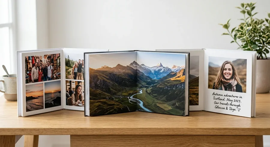
Grid layouts
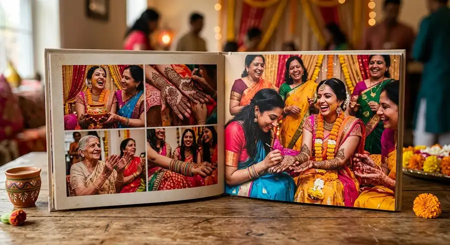
A grid places multiple photos on a single page in a structured arrangement - two photos side by side, three in a row, a 2x2 block. Grid layouts work best for collections where the images have equal importance and telling multiple moments together creates more meaning than any single image alone.
Candid shots from a party, street photography from a trip, seasonal family photos - these suit a grid. The rule I've found most reliable: maximum six images per grid page. Above that, individual images lose impact and the page starts to look like a contact sheet.
Full-bleed layouts
A full-bleed layout prints one image across the entire page or double-page spread, edge to edge, with no white border. This is the highest-impact layout for a single strong image.
According to Artifact Uprising's photo book design guide, full-bleed spreads are the most popular layout choice among professional photographers because they maximise visual impact and give landscapes, architecture, and portraits room to breathe. In a layflat book, a full-bleed double-page spread with no gutter gap is particularly dramatic.
Reserve full-bleed pages for your genuinely strongest images. Not every shot deserves it. Two or three full-bleed spreads in a book of otherwise grid layouts create punctuation - they make the viewer pause.
Text + photo layouts
A text + photo layout pairs an image with a caption, quote, date, or short paragraph. These pages do different work than pure image layouts - they anchor the viewer in context, add personality, and slow the pace of the book deliberately.
Use them for opening pages (title spread), chapter breaks between sections, and closing pages. Too many text + photo pages throughout the book interrupts the visual flow. One per section is usually enough.
Theme Ideas by Occasion
A theme is the visual and emotional consistency that runs through a book. Same colour palette, same layout style, same type of photos included. Without a theme, a book looks like a folder.
Wedding photo books
Wedding books are the most common and the most demanding design challenge. The temptation is to include everything. Resist it. The full breakdown of wedding photo book layouts by ceremony - mehendi, baraat, ceremony, reception - covers structure and page counts in detail.
A 40-page wedding book with 80-100 carefully chosen images tells the story of the day better than a 60-page book with 200 images that exhausts the viewer. The structure should follow the day's arc: getting ready, ceremony, couple portraits, reception. Each section gets its own visual rhythm - quieter pages for preparation, full-bleed spreads for the ceremony's peak moments.
Layflat binding is worth the premium for weddings specifically. Double-page ceremony spreads lose nothing to the gutter.
Travel photo books
Travel books work best when they follow a narrative - arrival, exploration, people encountered, departure. The mistake most people make is organising travel photos chronologically by date rather than by story arc. Both can work, but the story arc approach produces a more satisfying read. For a deeper guide on travel photo book design built around Indian trips specifically, that companion guide covers curation, format, and archival paper choice.
Include establishing shots of each location. One strong landscape or street scene at the beginning of each city or region anchors the viewer before moving into candid or detail shots. Shutterfly's photo book design guide notes that mixing portrait orientation (tall) and landscape orientation (wide) images across pages creates natural visual rhythm - a principle that applies regardless of which service you use.
Family and baby books
Family books tend toward the sentimental end of the design spectrum - warmer paper finish, more text captions, chronological organisation. Baby books especially benefit from date captions on key pages: first smile, first steps, first birthday.
The design trap here is too much decoration - clip art, stickers, busy backgrounds. Let the photos carry the book. A clean white or cream background with well-chosen images and minimal text almost always looks better than a heavily decorated page.
Indian occasion themes
This is the gap in most photo book design guides. India has occasion-specific design opportunities that generic templates don't address.
Mehendi and haldi ceremonies produce vibrant, colour-saturated images that suit bold, high-contrast layouts - full-bleed pages for the colour-rich moments, grid pages for the candid interactions. Avoid muted or pastel palettes for these books; they fight against the visual energy of the content.
Diwali albums - family gatherings, diyas, rangoli, fireworks - suit warm-toned designs with golden or amber accents. The photography tends toward mixed lighting (indoor + lamp + sparkle), which means paper finish matters: matte or lustre handles the colour complexity better than glossy, which can oversaturate already vivid images.
For cultural ceremonies like pujas, engagements, or naming ceremonies, a more formal structure works well - fewer images per page, more deliberate placement, text captions with dates and names.
Design Tips That Separate Good Books from Forgettable Ones
Edit your photos before uploading. Consistent colour grading across a book is the single biggest improvement most people can make without changing their layout. A page of six photos with inconsistent white balance looks amateur regardless of how good the layout is. Lightroom presets or even phone editing apps can bring a set of images into a coherent visual family in under an hour.
Keep the colour palette consistent. If your photos are warm-toned, use warm-toned text and border elements. If they're cool or desaturated, use neutral elements. Clashing tones between photos and design elements is immediately noticeable.
Use the opening spread carefully. The first two pages after the cover set the reader's expectations for the whole book. A strong opening spread - one or two images that capture the essence of the entire book - earns attention before a single page is turned.
On paper finish: glossy suits vivid colour photography (travel, celebrations, landscapes). Matte and lustre suit portraits and text-heavy pages, and they hold up better in India's humid climate - glossy prints in high-humidity rooms develop micro-scratches and fingerprint marks faster than matte equivalents.
What to Avoid
Including every photo you took. A photo book is not an archive. Ruthless editing produces better results every time.
Inconsistent font choices. One or two fonts per book. Mixing fonts across pages looks unplanned.
Low-resolution images. Most services flag images below 150 DPI at the print size chosen, but the warning is easy to dismiss. A blurry image in an otherwise sharp book draws the eye immediately and damages the whole book's quality perception.
Centring every single element. Centred layouts feel static. Try left-aligning text captions or using asymmetric image placement within a page grid for more visual interest.
For a comparison of which Indian services produce the best print quality at different price points, the India photo printing service comparison covers all the major providers.
FAQ
What makes a good photo book design?
A good photo book design has a clear theme, consistent layout grammar, a strong cover image, and edited photos with coherent colour grading. Fewer, better-chosen images almost always produce a better result than including everything.
How many photos should a photo book have?
Probably fewer than you think. Most people overload books with 200+ images when 60-100 across 20-40 pages tells a far better story. Wedding books can stretch to 120-150 across 40-60 pages. Baby books work best at the lower end - 40-70 images with breathing room.
What is the best layout for a photo book?
No single layout is universally best. Grid layouts suit collections of equal-weight images. Full-bleed layouts suit your strongest individual shots. Text + photo layouts suit chapter breaks and opening or closing pages. Most good photo books use all three in different proportions.
Should a photo book tell a story or just show photos?
A narrative structure - beginning, middle, end - consistently produces more satisfying books than a random collection. Even a family album benefits from chronological organisation with section breaks. The viewer feels a sense of progression rather than simply scrolling through images.
What finish is best for photo books in India?
Matte or lustre finish performs better in India's humid climate for everyday display. Glossy looks vivid initially but develops surface marks faster in high-humidity environments. For a photo book kept in a case and brought out occasionally, glossy is fine. For a book left on a coffee table or regularly handled, matte or lustre lasts better.
Does Memoriffy offer photo books?
Not yet - but launching soon. Memoriffy's photo books will use the same pigment-ink, waterproof-coating approach as their individual prints. In the meantime, polaroid prints and photo strips are available now and make for strong standalone gifts while you wait.
Good photo book design doesn't require a design background. It requires restraint - fewer photos, consistent choices, a cover that earns its place. Most books are improved by taking things out rather than adding more.
Memoriffy's photo books are launching soon. Get notified at memoriffy.com.